Email marketing has taken a back seat in recent years to newer digital marketing channels such as Facebook, Instagram, LinkedIn & Google. However, marketing and sales teams all around the world are still using email to drive results.
In the early days of email marketing, open rates could be as high as 75% to 85%. Today, the average email open rate is just above 20%. With email being such a saturated marketing channel, the trick is writing emails that people actually feel compelled to open and read.
Time spent crafting compelling email content is time well spent. Not only are emails easy to track and analyze, they also allow you the option to segment based on different types of customers and leads. It is important to keep in mind that if your messages aren’t crafted properly, it may be all for naught. Your emails must possess the following characteristics to be effective:
- Interesting. Don’t let your messages be more clutter in your recipients’ inbox; make them feel fortunate to have received something informative and entertaining from you.
- Valuable. The recipients of your emails should be enthusiastic to consume the content you provide. Ask yourself, “If I received this email, would I find it valuable?” If the answer is no, then it’s likely your subscribers will feel the same.
- Relevant. If your email isn’t pertinent to them, prospects and buyers will quickly delete the message. And if the content is consistently irrelevant to them, they’ll probably unsubscribe. Make sure the emails you send speak to the subscriber’s unique pain points.
- Timely. A big part of relevancy is timeliness. Consider a prospect’s location in the buyer’s journey to avoid jumping into a sales pitch too early.
The trick is figuring out how to cut through the clutter of a crowded inbox- and we’re here to help! I took a look at four different emails that I actually opened recently and explain exactly why I did.
I receive hundreds of emails a day, but the following four stood out for unique reasons. Key lessons can be learned from what the creators of these emails did effectively, and how their reasoning can be applied to your business.
1. The Get to the Point Email
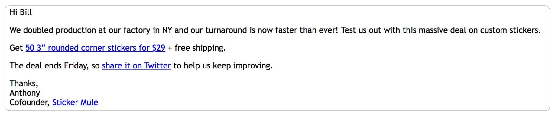
WHAT I LIKED ABOUT IT
Sticker Mule is an awesome, web-based sticker manufacturer. They have perfected the simple (no B.S.) text-based email with a high-value proposition. Whether it’s a new product announcement or a special discount offer, their message gets straight to the point. Their messages stand out in my crowded inbox.
MY TAKE AWAY/WHAT I’VE LEARNED
It’s always good to be reminded that sending clear messages with a high-value proposition to a targeted audience can result in high open and click-through rates. There’s also a very minimal setup time for these types of emails-a win-win!
2. The Informational/Resource/Headline Style Email
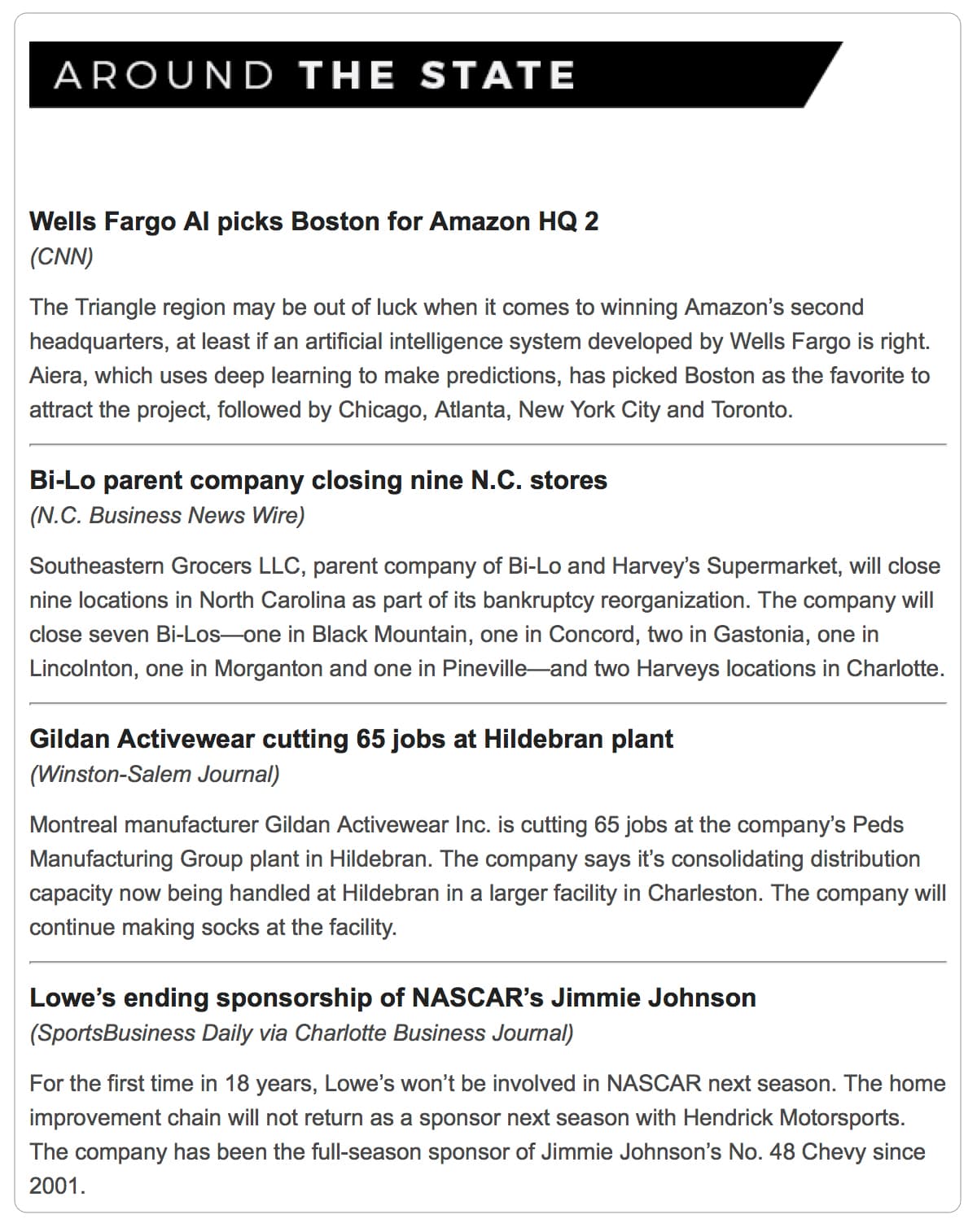
WHAT I LIKED ABOUT IT
I receive a good number of these headline-style email messages. The frequency varies from daily to weekly, but I like that most are well organized with a headline and intro text so that it’s easily skimmable. I can click on the article for more information.
MY TAKE AWAY/WHAT I’VE LEARNED
Providing links for your customer to read more is a good idea to encourage click-throughs to your website. Another lesson can be learned from the effectiveness of the skimmable body text: Try to stay away from adding extraneous information. Your customer should be able to understand the main takeaways from your message easily.
3. Graphical Style Emails
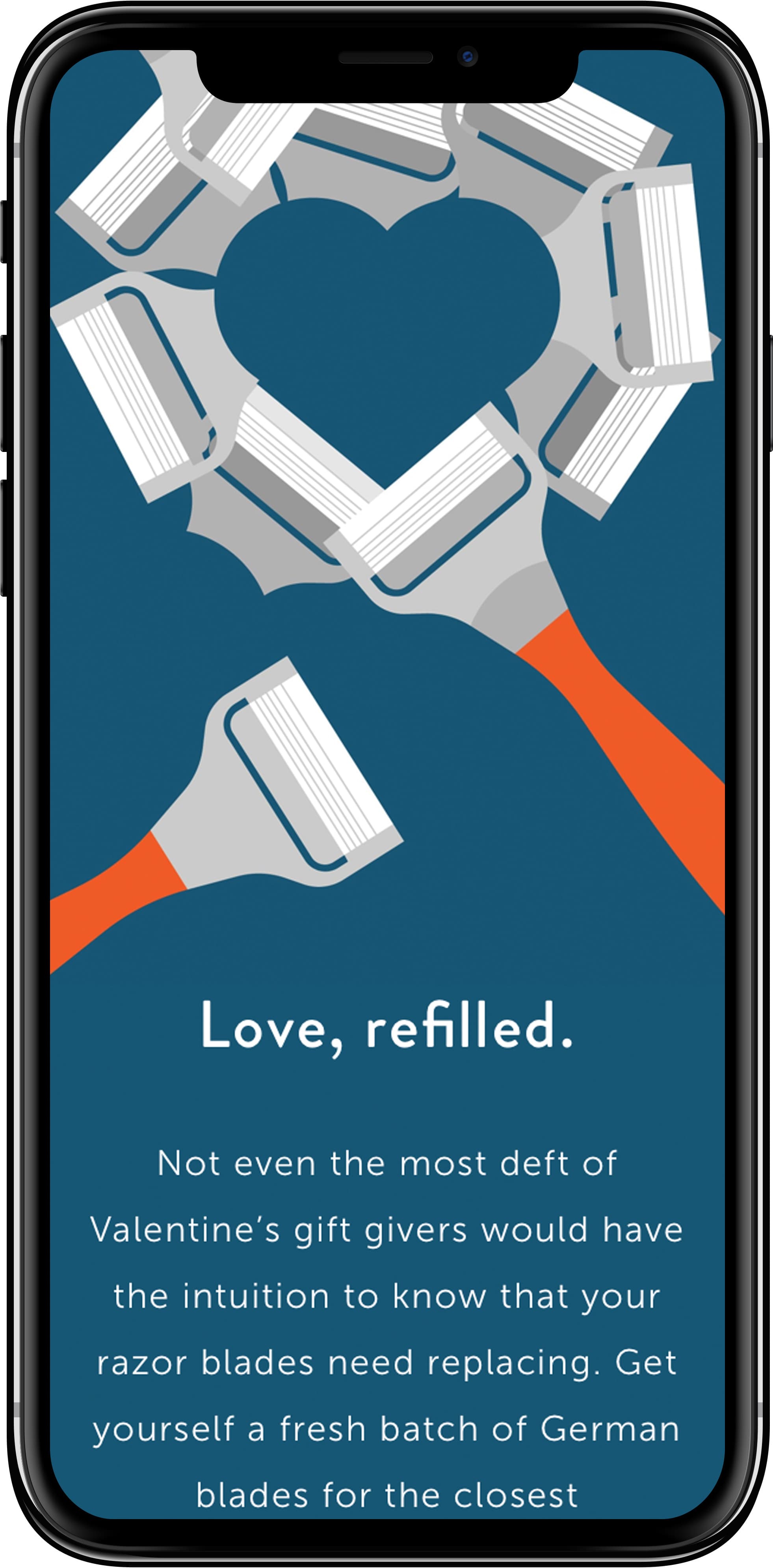
WHAT I LIKED ABOUT IT
These graphical emails always grab my attention. The simple color scheme, clever layout, and mobile-friendly format stand out in my inbox. I find that I am genuinely interested to see what creative design concepts they’ll send next.
MY TAKE AWAY/WHAT I’VE LEARNED
Compelling design is a wonderful way to communicate with your customers. It is a simple, powerful way to showcase your brand personality as well as show off your design skills!
4. Funny/Clever Call to Action/Scrollable emails
WHAT I LIKED ABOUT IT
Invision uses simple persuasive content alongside relatable images to get you interested to read their content. Showing relevant images behind the CTA helps people visualize themselves using the product and in turn, make clicking-through more appealing. Invision also makes sure to use friction-free text on their button making it inviting to get started with their program.
MY TAKE AWAY/WHAT I’VE LEARNED
Less is More. When designing emails, it can be tempting to make an elaborate, impressive email filled with extra features, endless graphics, and loads of crafted content. However, most of these combinations will only serve to complicate the end user-experience. Instead of getting caught up in all the bells and whistles email platforms have to offer, focus on creating a simple user experience.
The possibilities for different types of emails you can craft are endless. There are sign up emails, clever confirmation emails, product demo emails, media-based emails, and more. The most important thing to remember is to keep the “WIFM” (What’s in it for me?) for your customers in mind as you write them. There should be a tangible benefit and reason to open your email- now you just have to decide what that will be!