We’ve been building logos and brand systems for over 20 years, and one question comes up more than almost any other from business owners: how do you actually know when it’s time for a change?
There’s a real difference between a brand that feels established and one that feels stale. And honestly, most businesses don’t let their branding age on purpose. It just happens. You’re heads down serving clients, growing your team, refining what you do, and the logo you launched with five or ten years ago never quite made it onto the to-do list.
It might still look fine on a business card or a sign out front. But as more of your marketing moves to websites, social media, and mobile, little cracks start to show. The logo doesn’t fit cleanly in a profile photo. It looks oversized in your website header. On a phone screen, the detail gets lost. What worked great in a print-first world doesn’t always hold up in the digital spaces where most customers will find you now.
If that’s starting to sound familiar, you’re not alone. Here are a few practical ways to figure out whether you need a new logo, a broader brand refresh, or just a few targeted fixes.
Key Article Takeaways:
- A busy or fragile logo, inconsistent visuals, and outdated typography are the clearest signs your brand may be showing its age.
- Looking outdated isn’t just an aesthetic problem. It affects how customers perceive your credibility, professionalism, and pricing.
- If your brand wasn’t built for mobile and social, showing up consistently is harder than it needs to be.
- You don’t need to reinvent your brand every few years. You just need it to support how your business operates today.
Start with What People Actually See
Outdated brands usually show their age visually first.
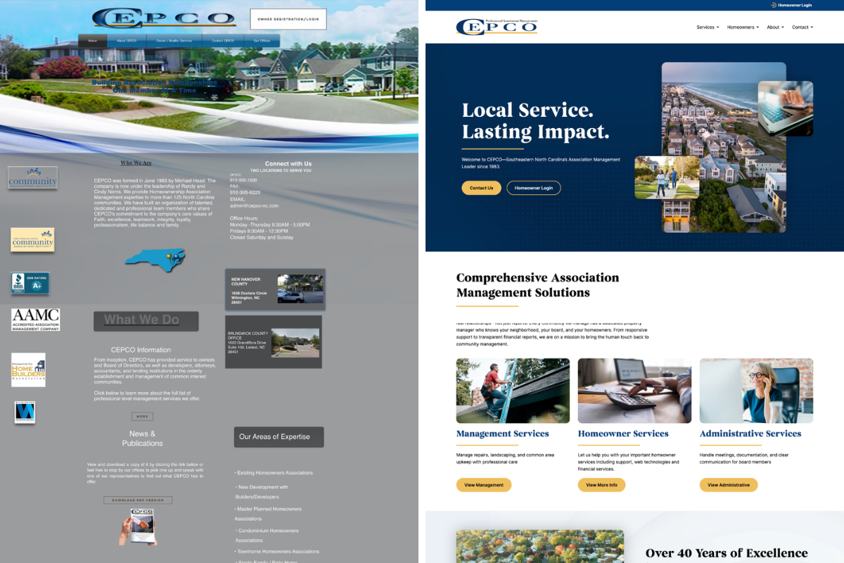
The “Looks Fine in Print” Problem
Many older logos were designed for print-first environments, relying on thin lines, detailed illustrations, multiple colors, gradients, or drop shadows. On signage, they may still look fine, but shrink that same logo down to a social media profile image or mobile header, and it can quickly become illegible.
A strong modern logo isn’t necessarily minimal, but it is durable. It should hold up in black and white, stay recognizable at small sizes, and not rely on decorative effects to feel complete. If your logo only works in one specific format or size, it wasn’t built for how brands show up today.
Your Fonts May Be Giving You Away
Fonts change the feel of a brand almost instantly. Heavy scripts, novelty fonts, ultra-thin lettering, and decorative type treatments can anchor your brand to a specific era, and they often don’t translate well digitally. If your headlines are hard to read on mobile or your body copy feels cramped, that’s a usability problem, not just an aesthetic one. Clear typography communicates confidence; overworked typography creates distraction.
Your Visual Identity Feels Inconsistent
Open your website, then your social media, then a recent PDF or proposal. Do they feel cohesive? Or does each piece feel slightly disconnected, with different blues, different fonts, different graphic styles?
Inconsistency is often a symptom of an aging brand system. When guidelines aren’t clear or flexible, teams improvise. Over time, the brand drifts, and that drift is noticeable, especially online.
Looks Aren’t Everything. Performance Matters Too
A brand can look fine at first glance and still be outdated in function.
It Doesn’t Translate to Social
Social platforms are often the first touchpoint a potential customer has with your business. If your logo isn’t recognizable as a circular profile image, your colors don’t work well in digital graphics, or you lack clear templates, showing up consistently becomes difficult. That friction leads to fewer posts, rushed graphics, and an uneven presence.
It Wasn’t Built for Mobile
Most customers will encounter your brand on their phone before anything else. Open your website on mobile: Is your logo overwhelming the header? Are your fonts easy to read without zooming? Do your brand graphics scale cleanly? If your brand was developed in a desktop-first era, it may not adapt well to today’s mobile behavior, and that’s a usability issue, not just a design trend.
It Feels Like a Brochure, Not a Tool
Older brand and website approaches often focused on listing information rather than guiding action. If your homepage is text-heavy, unclear about what you actually do, or missing strong calls to action, your brand may be operating on an outdated strategy. Modern branding helps visitors quickly understand who you serve, what you offer, and what to do next.
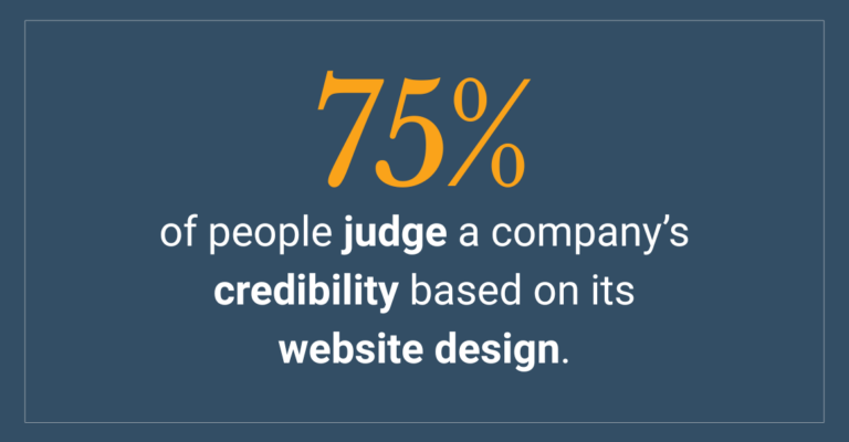
Why This Quietly Costs You Business
Customers won’t consciously think, “This brand feels dated.” Instead, they’ll quietly wonder: Are they still active? Are they established? Are they worth the price? Visual presentation influences perceived credibility, and credibility influences buying decisions. If your competitors appear more current, more cohesive, or easier to understand, that comparison happens instantly, especially online. An outdated brand doesn’t just affect aesthetics; it affects your positioning.
Try This Quick Comparison
Search for your service the way a customer would. Pull up your website alongside two competitors and ask yourself honestly: Which business looks the most current? The most trustworthy? The clearest? If your brand doesn’t immediately hold its own, that’s useful information.
The Bottom Line
Modernizing your brand isn’t about chasing trends or reinventing yourself every few years. It’s about making sure your visual identity supports how your business operates today, across social platforms, digital ads, websites, and mobile devices. Your brand should make marketing easier, reflect your current level of expertise, and support your pricing and positioning. If it doesn’t, it may not be broken, but it may be outdated.
And recognizing that is the first step toward building something stronger.If you’re not sure where to start, Wilmington Design can help. Whether you need a full brand refresh or just a logo that works harder for your business, we’d love to take a look. Let’s talk!