When business owners come to us for a new website, the conversation often starts with how it should look. Colors. Fonts. Vibe. Inspiration pulled from other sites they like. That part matters, but it’s rarely what makes a website work.
A website that performs well doesn’t just look good. It helps the right people find what they need, understand what you do, and take the next step without friction. That’s the user journey, minus the buzzwords.
Let’s break it down in plain speak.
What “User Journey” Really Means
Flowcharts and fancy diagrams can be helpful, but at its core, a user journey answers three simple questions:
- Why did someone come to your site?
- Can they quickly tell if they are in the right place?
- Is it obvious what to do next?
If a website answers those questions, it performs better. If it does not, even the best design can struggle. Most underperforming websites fail in the first few seconds. Not because they aren’t attractive, but because they make people work too hard to understand what you do.
Performance Starts Before Design
One of the biggest mistakes we see is jumping straight into design without thinking through the purpose of the site.
Before we design anything, we focus on:
- Who the site is for.
- What those visitors are looking for.
- What action actually matters to the business.
Is the goal to place an order, call, visit a location, or learn the brand story? A homepage typically struggles to do all of those equally well. It has to prioritize. Once that’s clear, design decisions become much easier and much more effective.
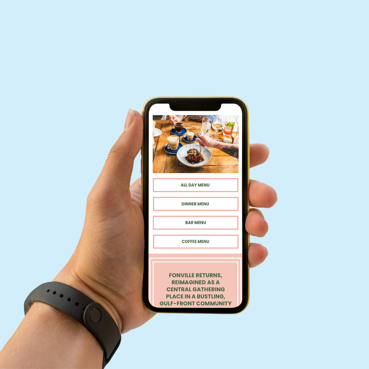
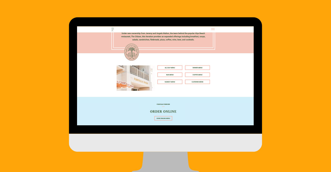
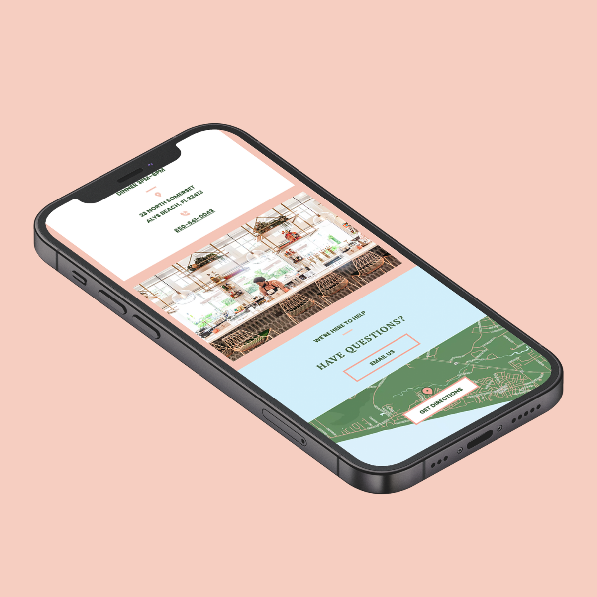
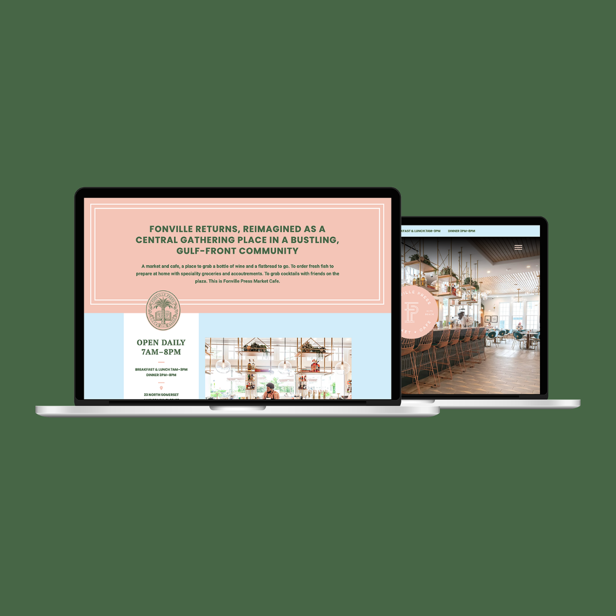
A Real Example: Fonville Press Market & Café
When we worked with Fonville Press Market & Café, the goal was not to build a flashy website. The goal was to support a real, physical experience.
People visiting the site were typically looking for one of a few things:
- What kind of place is this?
- What do they offer?
- Where is it and when are they open?
The site is structured to answer those questions quickly. The homepage doesn’t overwhelm visitors with long explanations. It sets the tone, shows the space, and makes it clear what Fonville Press is all about. From there, visitors can easily explore the market, café offerings, or find location details without digging. That’s intentional. The site mirrors how someone would naturally think before visiting in person.
The Quiet Details That Matter
Good user experience often goes unnoticed, and that’s the point.
Things like:
- Clear navigation labels.
- Logical page order.
- Consistent calls to action.
- Mobile-friendly layouts that actually work on a phone.
These details don’t get compliments, but they drive results. They reduce confusion, shorten decision time, and make it easier for someone to take action. When those things are missing, people leave. Not because they dislike your business, but because the website did not help them fast enough.
Design Supports the Journey, Not the Other Way Around
A strong visual brand absolutely matters. But design should support the journey, not fight it. If a visitor has to stop and think about where to click next, you are missing an opportunity. If the most important information is buried halfway down the page, the page is not doing its job. The best-performing websites feel simple because the hard thinking has already happened behind the scenes.
What Business Owners Should Take Away
You don’t need to learn web jargon to have a website that performs well. You just need to focus on a few fundamentals:
- Be clear about who the site is for
- Make it obvious what you do
- Remove obstacles between visitors and action
When those pieces are in place, design becomes a powerful tool instead of a distraction. That’s how we approach every project.. We try to strip away the noise, focus on what matters, and build websites that work for the business, not just the portfolio.
If you are thinking about a new website and want help sorting out what actually matters, let’s have a conversation.