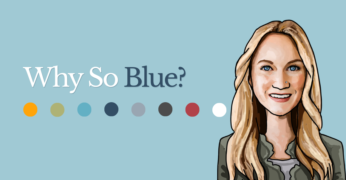
“Why so blue?” is usually something we ask when someone seems a little down or somber.
Lately, though, I’ve been asking myself that question while looking at business branding. Why is everything so blue? A couple of recent experiences got me thinking about it.
First, I was refreshing paid social ads for several clients. These were different businesses with different audiences, but somehow, I kept finding myself working with shades of blue.
Then, during a website planning exercise with another client, the conversation started moving toward a complete branding overhaul. Their existing brand used red and white, but by the end of the call, they were leaning toward coastal shades of…you guessed it, blue! Coastal blues and greens, to be exact.
Which is great. I love a coastal color palette. But it brought me back to the same question: Why is everything so blue?
It All Comes Back to Color Theory
With my design school background, case studies I worked through in school, and real-world application, I know there is a reason certain colors appear again and again.
Whether people realize it or not, they are naturally drawn to colors based on personal preferences, past experiences, cultural associations, and the feelings tied to certain colors.
Blue, for example, is often associated with trust, stability, and dependability. Softer shades can feel calm and approachable. A deeper navy can feel established, professional, and even a little elite.
That makes blue a pretty safe choice for businesses. It is used by banks, healthcare companies, technology brands, professional service firms and plenty of other companies that want customers to feel confident working with them.
But color is doing more than making something look good. It is communicating before a customer reads a single sentence.
Colors Create Connections Without Words
Think about how quickly we connect certain colors with brands, holidays, and familiar experiences.
- If I held up a combination of yellow and red, would McDonald’s come to mind?
- What about purple and green? If you’re a millennial like me, there is a good chance you are thinking about Barney.
- Red and green are connected with Christmas, while orange and black immediately feel like Halloween.
The colors alone are enough to create recognition. These are psychological and emotional associations built through years of exposure. Some are nearly universal, while others depend on a person’s culture, age, location, and experiences.
That is why choosing brand colors should involve more than picking whatever happens to be your favorite. Your color palette should support the story you want your business to tell.
Case in point: One of our commercial real estate clients recently stepped away from a national brokerage and created a brand of its own. They chose turquoise and blue tones that complement the local university’s colors and reflect the coastal waters of the area. The new palette made the brand feel more connected to the region, more personal and more rooted in the local community.
What Do Different Brand Colors Communicate?
There are no absolute rules. The shade, typography, photography, and overall design all affect how a color feels. However, colors tend to carry some common associations. We’ve given an overview of it below:
| Color | What It Can Communicate | Common Brand Uses | Things to Consider |
| Blue | Trust, calm, stability and professionalism | Healthcare, finance, technology and professional services | Blue is very common, so the overall design needs personality to avoid blending in |
| Red | Energy, passion, urgency and confidence | Food, entertainment, sports, retail and automotive | Bright red can feel intense or aggressive when overused |
| Green | Growth, health, nature and renewal | Wellness, finance, landscaping, food and environmental brands | Bright, earthy and dark greens can each create very different impressions |
| Orange | Creativity, friendliness, energy and approachability | Construction, home services, fitness, food and youth-focused brands | Works well as an accent but can become overwhelming in large amounts |
| Yellow | Optimism, warmth, happiness and attention | Hospitality, food, childcare and service businesses | It attracts attention but can be difficult to read against light backgrounds |
| Purple | Creativity, imagination, luxury and individuality | Beauty, wellness, creative services and specialty retail | Deep purple can feel premium, while brighter shades feel playful |
| Pink | Warmth, care, cutesy, personality and confidence | Beauty, lifestyle, wellness, retail and modern consumer brands | Soft pink feels calming, while bright pink can feel bold and energetic |
| Black | Strength, sophistication and exclusivity | Luxury, fashion, technology and premium services | Too much black can feel heavy or unapproachable |
| White | Simplicity, cleanliness and openness | Healthcare, design, wellness and modern brands | White space can feel polished, but the design still needs enough visual interest |
| Gray | Balance, practicality and professionalism | Corporate, industrial, technology and professional services | Gray is versatile but may feel generic without a stronger supporting color |
Pastel Versus Bold Colors
The intensity of a color can completely change the personality of a brand.
| Style | What It Often Communicates | Where It May Work Well |
|---|---|---|
| Pastel colors | Calm, softness, friendliness and approachability | Wellness, lifestyle, children’s products, coastal brands and hospitality |
| Bold colors | Energy, confidence, excitement and visibility | Fitness, entertainment, retail, food and brands competing for attention |
| Light colors | Openness, simplicity, cleanliness and ease | Healthcare, professional services, lifestyle and modern brands |
| Dark colors | Sophistication, strength, drama and authority | Luxury, finance, technology and established professional brands |
Please note that neither approach is automatically better. It just depends.
A bold palette might be perfect for a fitness studio but uncomfortable for a counseling practice. A soft coastal palette could work beautifully for a waterfront community but feel too relaxed for a high-performance automotive brand.
The right choice depends on the business, audience, and overall brand personality.
Your Colors Need to Work Everywhere
Brand colors need to do more than look good in a logo. They should work across your website, social media graphics, advertisements, signs, printed materials, uniforms, packaging, and physical location.
For a brick-and-mortar business, carrying brand colors into the space can help create a connected experience. Customers should feel like they are interacting with the same company when they find you online, open an email, or walk through the front door.
That consistency helps people connect your colors with your business. Over time, they may begin recognizing your company before they even see the name.
Before Choosing Your Brand Colors
Consider how you want customers to feel when interacting with your business. Should the brand seem calm, energetic, dependable, luxurious, playful, or established?
It is also important to look at the colors commonly used within your industry. Sometimes it makes sense to fit comfortably within those expectations. Other times, choosing something different can help you stand out.
Your colors should also be practical. They need to remain readable, accessible, and recognizable across screens, printed materials, signs, and other real-world applications.
That gives you a much better starting point than simply saying, “I like blue.” Although, apparently, a lot of us really do like blue.
Your Branding Matters
Your branding matters, and your color choices are a big part of it. The right color palette can help tell your story, guide the design of your logo and website, create consistency across your marketing, and shape how customers feel about your business.
Color is not the entire brand, but it is often one of the first things people notice (consciously or subconsciously) and one of the easiest things to remember.
When you are investing in a complete branding package, professional guidance can make a difference. Our team has been around the block a time or two. We have seen what works (and what does not ) and what may look great on a mood board but fall apart when applied to a website, sign, or business card.
We can help you build a brand identity that looks good, makes sense for your business, and works everywhere you need it to. Because sometimes blue really is the right answer. It just should not be the answer by default.