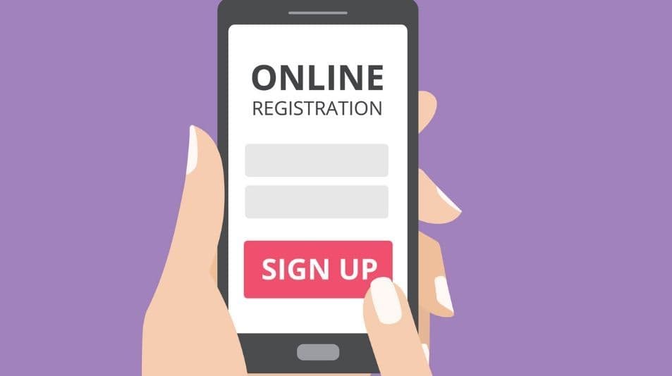
Whether designed to complete purchases, collect newsletter sign-ups, or register interest in your product or service, website forms remain one of the most important types of interactions for users on your website.
Since these forms typically connect web visitors with their end goal, user experience, and form design has a huge impact on overall conversion rates.
In order to successfully capture lead info and guide users down the sales funnel, your website forms should be fast, easy, and hassle-free.
Here are our top five tips to increase your completion rate and make your form the best it can possibly be!
- Make sure it’s a multi-step form. Nothing will cause users to click away faster than seeing an overwhelming single-page form with endless open fields to fill in. Instead, utilize a sleek multi-step design that has a built-in progress bar. This will automatically increase the number of users who fill out your form because people will have an unconscious motivation to finish it.

- Keep it simple. Every additional field that you ask your users to fill out decreases the chances that they actually will. In recent years, companies like Expedia have saved millions of dollars by trimming down their forms, harnessing the power of simplicity and removing all non-essential fields.
- Use conditional logic. Conditional logic will only display certain questions if the person answering a previous question responded in a certain way. For example, if they selected “I’m a return customer” instead of “I’m a new customer” from a drop-down box, the next question would lead to “Rank your previous experience” instead of “What brings you to the website?” Conditional logic streamlines the process of filling out the form for your user, and the more streamlined you can make the overall experience, the better.
- Use imagery in your multiple choice selection options. Whenever you can, utilize clickable icons and imagery as options. They’re the most engaging question type by far!

- Be fully transparent with why you’re asking for sensitive information. In the age of “techlash,” people are wary of sharing their personal information like phone numbers and email addresses online, especially if the companies aren’t being open about where their information will be going. Make it easy for your form users to read where their information will go, and they’ll be much more willing to share.
No matter what type of business you run or work for, chances are you have at least one type of web form on your site. By applying these form design tips that enhance UX, as well as UI design, mobile form design, and CTA design, you’ll provide your visitors with a reliable and positive experience that helps you boost conversions. So, think about the forms that you need to include on your site and begin implementing design tips and takeaways that apply best to your business’ needs and goals.