We created a logo with a unique color palette that is visually simple and clean. The icon combines the three letters (SCP) to create a flowing monogram. The angled letters and outlining shape reference the angular nature of construction and structures.
Sun Coast Partners Commercial
We helped one of the area's largest commercial real estate firms shed its corporate shell and emerge as a bold, independent brand. A striking custom monogram and a coastal color palette evoke trust and sophistication. From eye-catching signage to tailored marketing materials, we ensured every touchpoint whispered "local experts."
- Branding
- Website Design & Development
- Print & Advertising
Branding
Website Design & Development
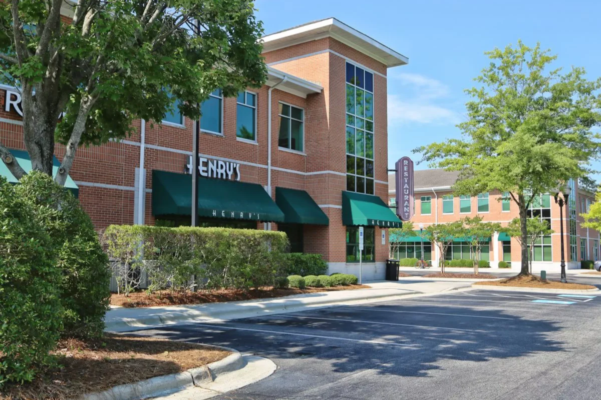
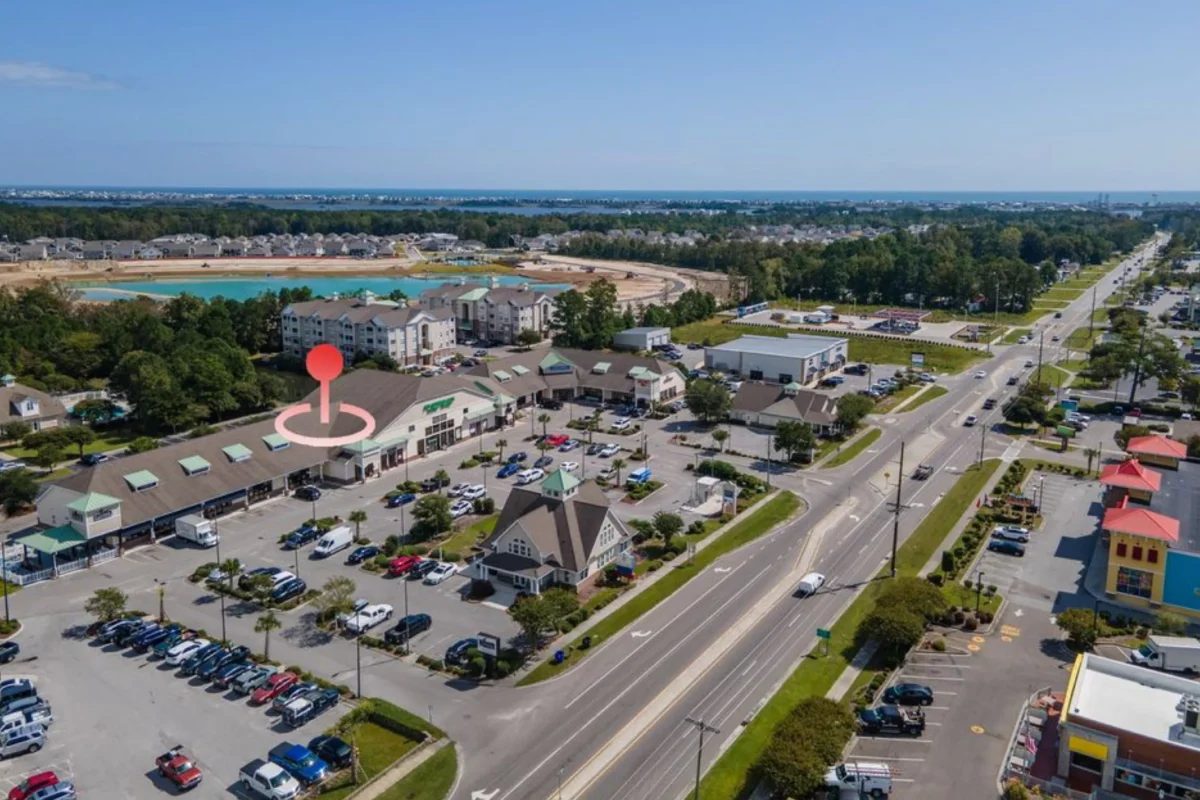
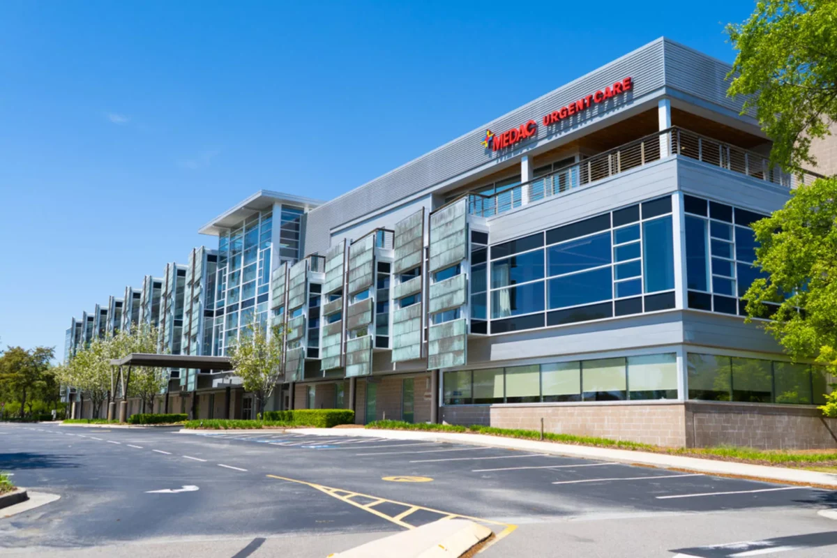
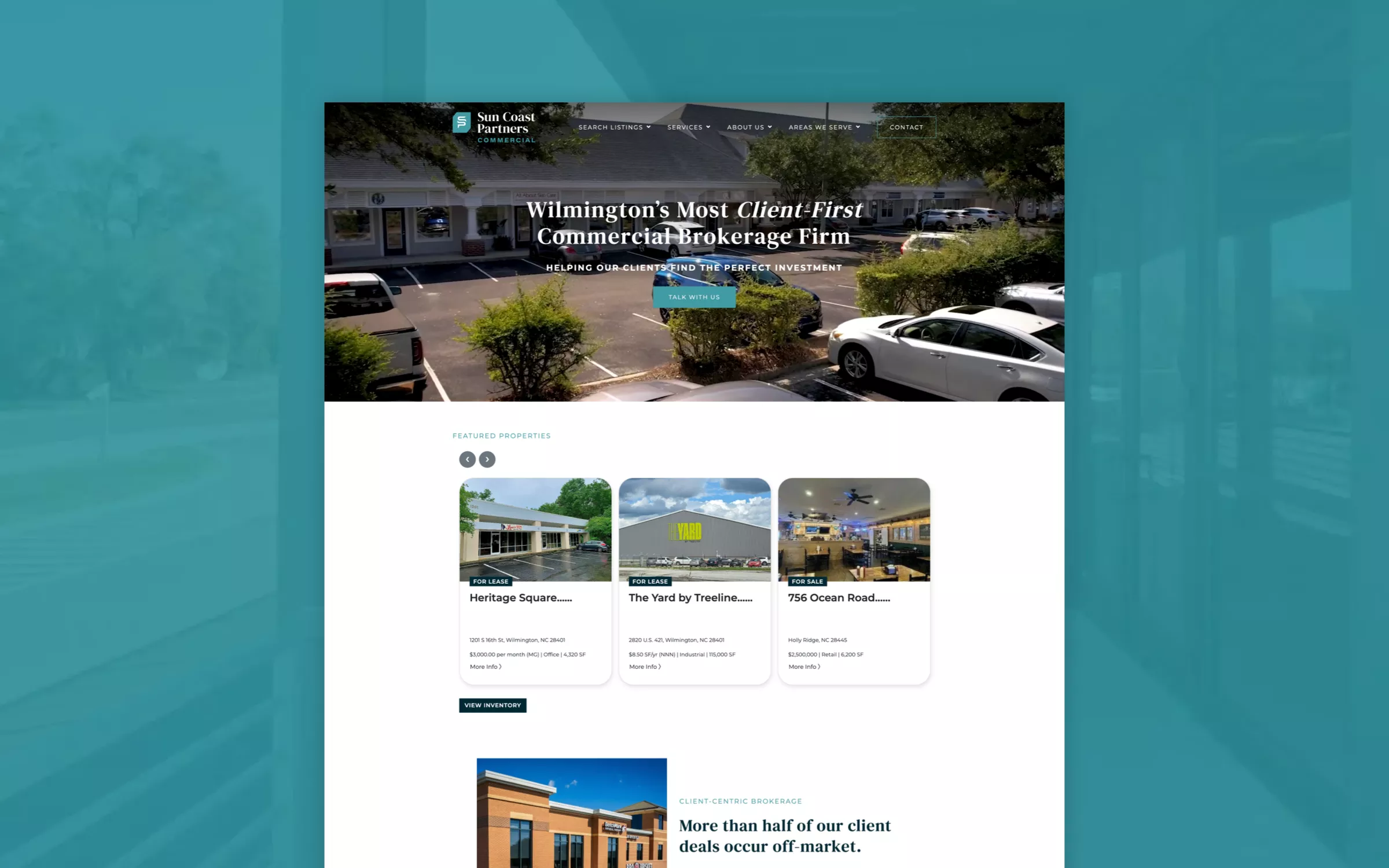
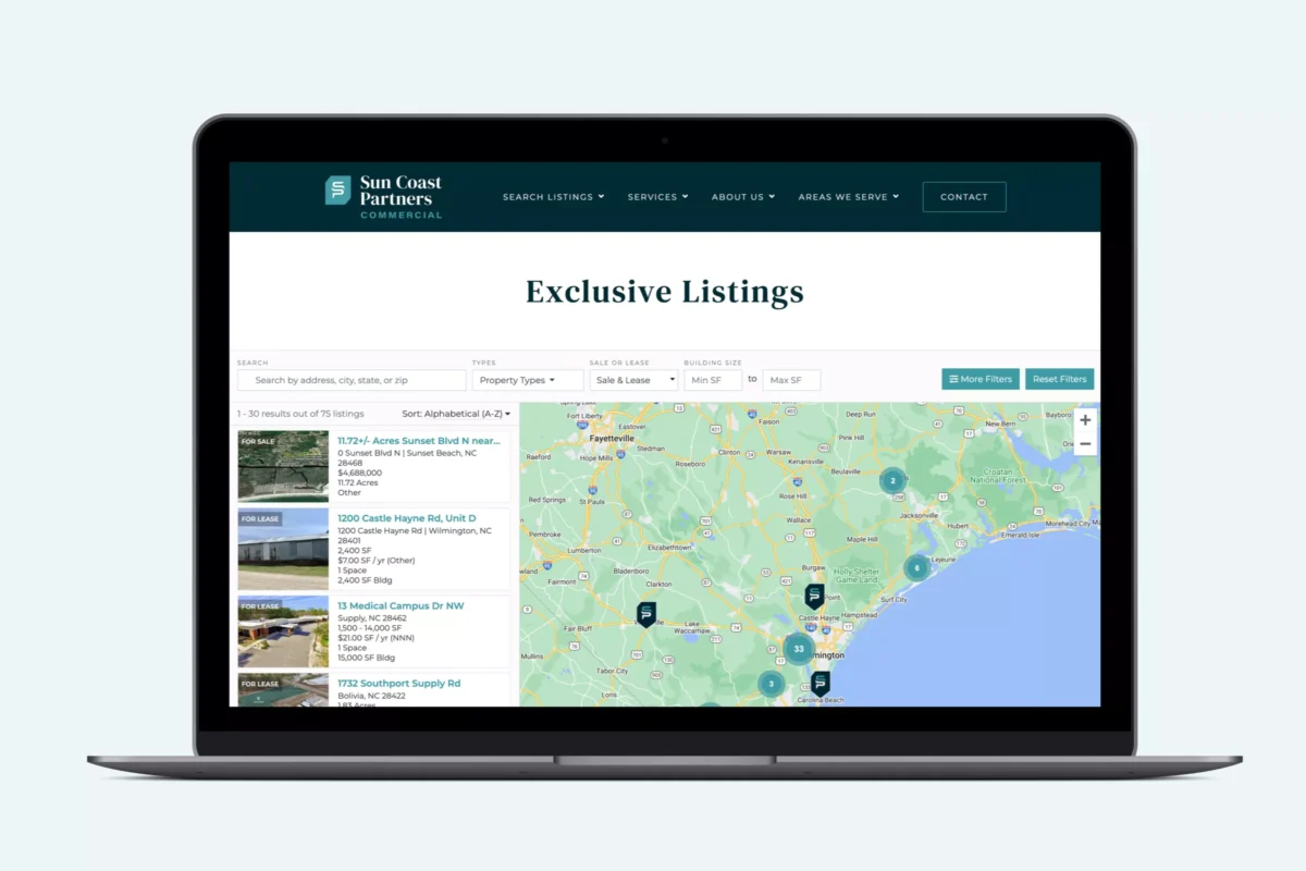
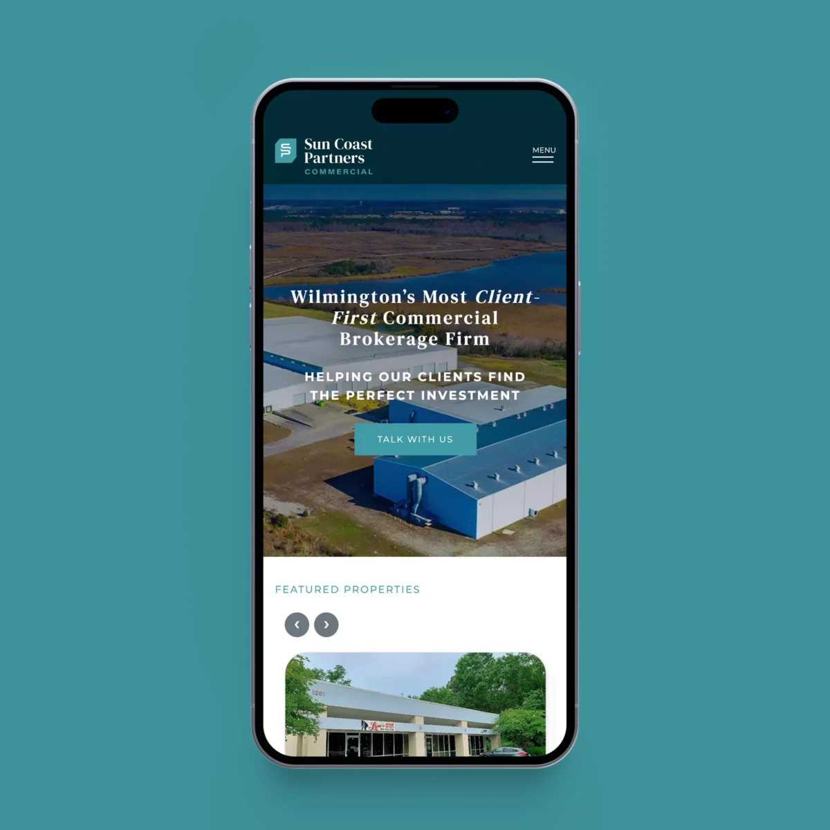
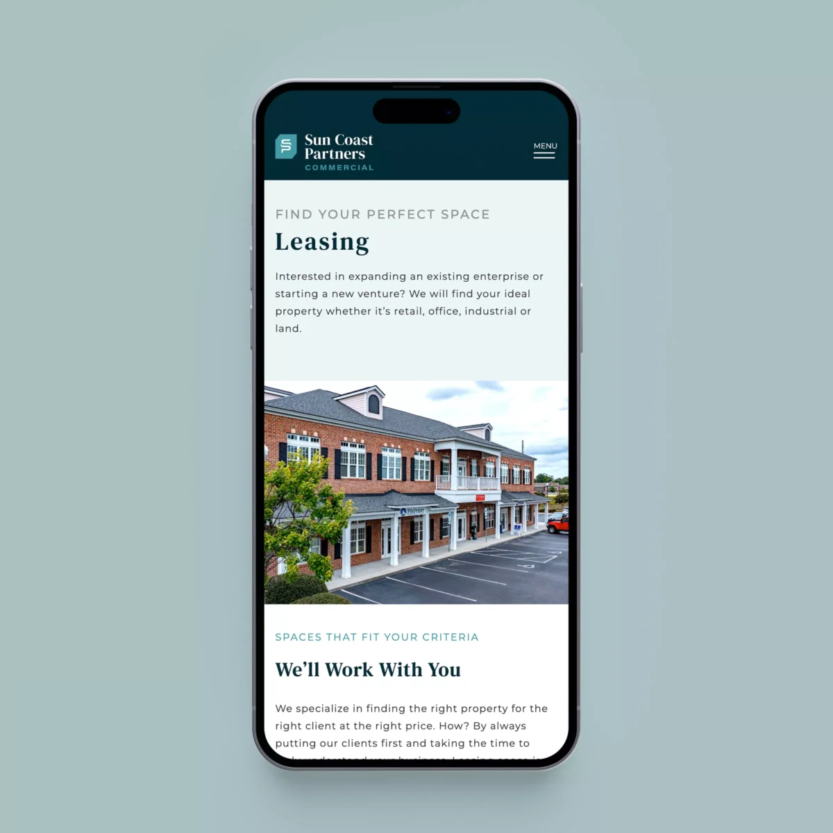
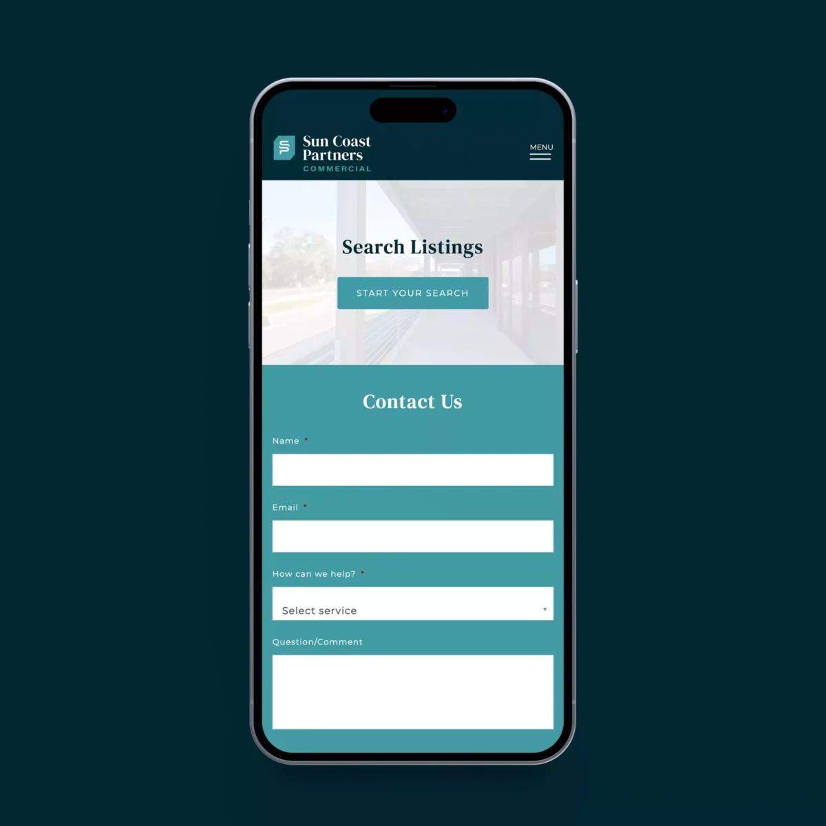
We revitalized the Sun Coast Commercial Partners website, enhancing its design and functionality to better showcase their commercial real estate services. The new site features streamlined navigation, high-quality property visuals, and optimized content, resulting in improved client engagement and accessibility.

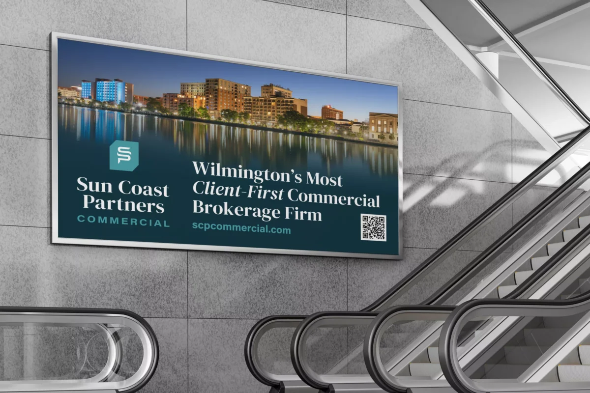
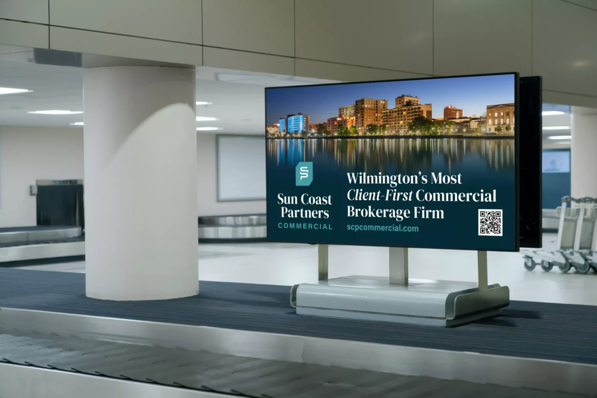
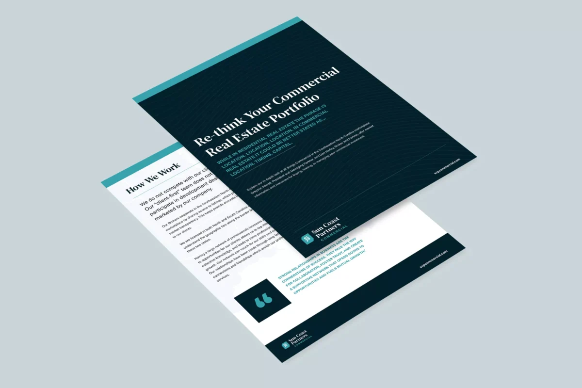
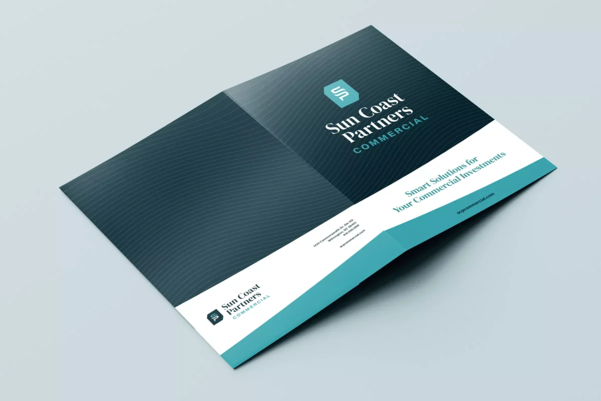
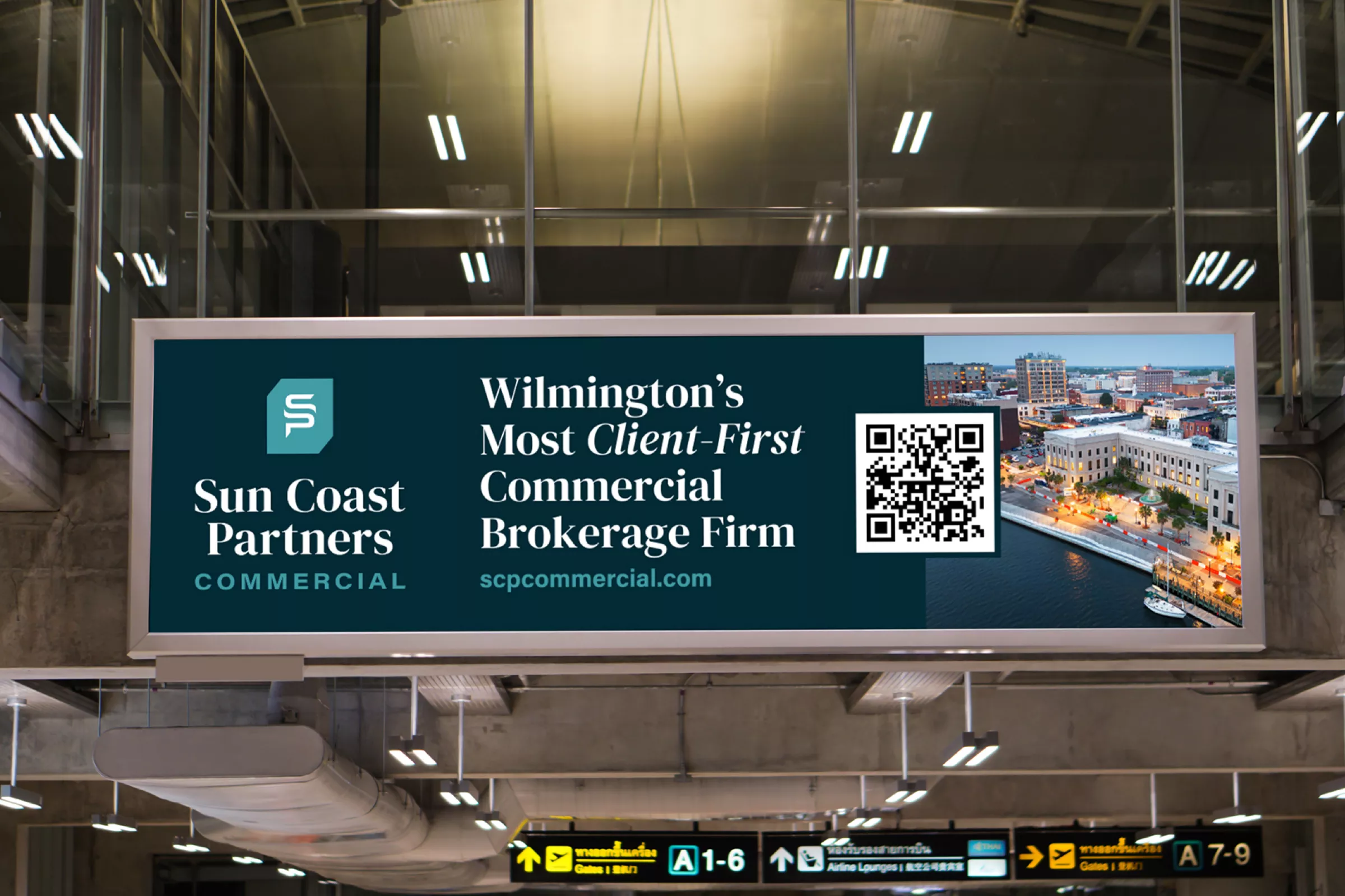
Print & Advertising
We took SCP's new logo and designed a cohesive brand collateral package and eye-catching advertising for placement at the Wilmington International Airport, ensuring their message reached travelers with maximum impact. From dynamic signage to strategically placed digital displays, we crafted a compelling presence that elevated their brand visibility and engagement.