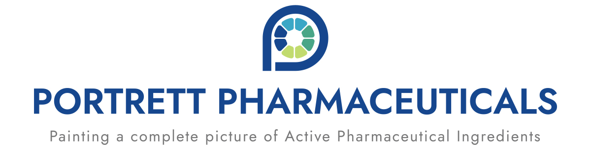
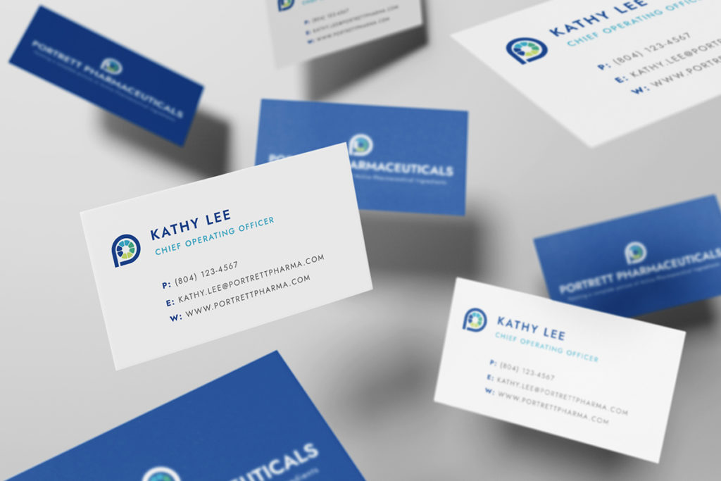
We played off three separate elements when creating the logo, including the letter P, a painter’s palette, and a pill box. We used blues for professionalism as well as greens for health based on color psychology. The logo can be used with or without the tagline, and is easily legible on white pharmacy jackets.
Portrett Pharmaceuticals
"Portrett" is Italian for characterization, and the name plays off the company's tagline of "Painting a complete picture of APIs." Their new logo and brand subtly alludes to it as well while still remaining sleek and professional.
- Branding

Branding