Many people will admit to losing focus as they skim through lengthy text in books, articles, and emails, then needing to read it several more times again to fully comprehend what is being said. However, just because forgetting is a human phenomenon, it doesn’t mean you should simply accept it.
Across the board, we are able to retain 80% of what we see, as opposed to 20% of what we read. Recent studies at MIT have shown that humans can process images and visual messages in as little as 13 milliseconds – a.k.a. 13/1000th’s of a second!
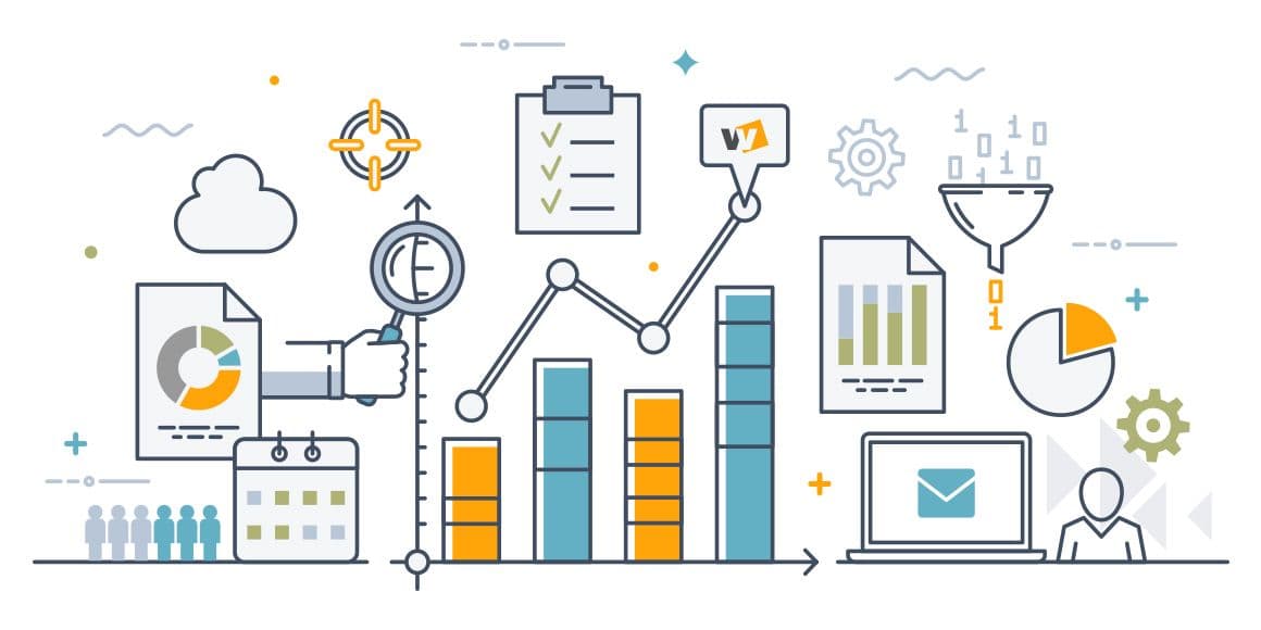
In order to help our team and our clients better understand the complexities of vast data, we strive to present information in an attractive and visually appealing way. It’s been said that data is nothing without visualization, which is why we’re highlighting the benefits of data visualization:
- Create operational efficiencies
- Increase productivity and profit
- Unveil untapped markets
- Create a layer of accountability
Data visualization is a general term that describes an effort to help people understand the significance of data by placing it in a visual context. Patterns, trends, and correlations that might go undetected in text-based data can be exposed and recognized easier.
This visual way of reporting on data is the best way to communicate insights derived from data analysis. In today’s business landscape, it’s more important than ever to make data-backed decisions, yet many of us lack the skills needed to extract actionable insights from raw data.
As you think about your business’s data visualization efforts, ask yourself:
Are we communicating our data in a uniquely visual way?
Or are you resorting to Excel’s “Insert Chart” function? Take a step back and think about how you can approach your data in a unique way. Consider setting aside time to brainstorm about the best approach and investing in more thoughtful design.
Is our current approach to sharing our data visually difficult to understand?
Can your audience tell what you’re actually trying to say? You might have to shake up the status quo by approaching your data visualization in an entirely new and unprecedented way to break through the confusion.
At the end of the day, are we telling a compelling story?
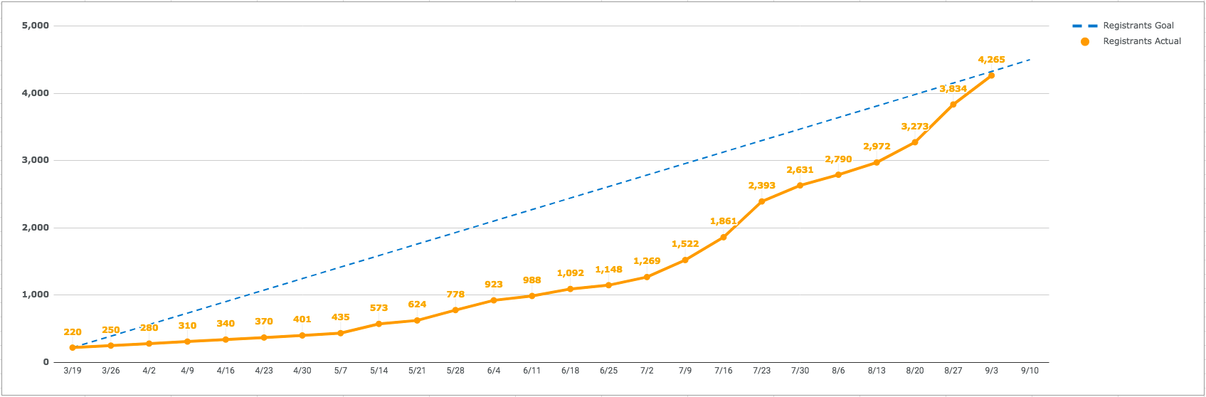
Are you showing an increase in a key performance indicator (KPI) over time, what does that really mean for your client? Don’t get lost in the numbers themselves. Ensure that your visualization incorporates the big picture and the decisions made along the way that triggered specific outcomes in the data. For example, if you work with a client for social media strategy and pivoted to emphasize video content one month, find a way to tell that story as you present the content’s performance data.
Is our data specific to our client’s goals?
You can create visuals for a seemingly infinite amount of data, thanks to countless monitoring and reporting platforms. But if the data you’re analyzing isn’t specific to your client’s goals, then it will do nothing but add clutter to an increasingly distracted world. Hone in on the specific data that matters to the conversation with your client.
The sheer amount of data and raw information that is readily available today is astonishing. Thanks to incredible advancements in technology, we can harvest data to improve our businesses and client relationships drastically. Shake things up by thinking twice about design and watch the benefits from data visualization dramatically change your business for the better.
Curious about where to begin? We’re happy to help! Let’s chat and get started.