How important are the colors that you choose for your company logo/brand?
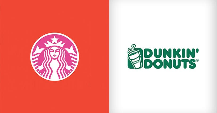
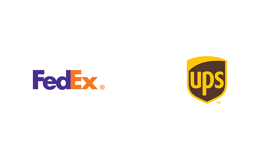
To help answer that question, a Brazilian graphic designer named Paula Rúpolo, came up with an interesting idea: what would brand identities (logos) look like if their colors were swapped with those of their competitors? The series, which is well worth checking out, included color swaps of such well-known brands as Starbucks/Dunkin’ Donuts, FedEx/UPS, ebay/Amazon and more.
“The point of the whole exercise for me, as a graphic designer, was to explore how we associate a certain colour scheme to a given company or product. We tend not to compare competitors’ colour schemes unless we are actually commissioned to design a logo and need to benchmark some standards.”
Now Rúpolo has created a second series and draws the conclusion that when choosing colors for a logo a key factor is “a question of competitive analysis and making the right calls based on extensive research.”
Here are a few of our favorites below, you can see more examples on the The Brand Color Swap.


You can read the full article here:
The colors that you choose for your logo communicate information about your brand to customers. By clearly defining your purpose, identity and role, we are able to reach loyal customers and add value to your business. Our designers will work closely with you to develop a logo and or brand that demand attention.
Learn more about our Logo design & branding services work here.