
To grow your business, you need more sales. To get more sales, you first need more leads. Leads can come from a lot of sources, but in today’s digital age, your website should be a primary driver. If your website is not driving leads for your business then there might be a problem with what you’re doing online.
One of the common problems we see with websites has to do with lead forms. Whether you’re prompting visitors to contact you, sign up for a service, or get a quote, web forms are one of the most important ways to capture leads from your visitors. Since form submissions are a major digital lead source, it’s important to make sure you’re doing everything you can to get more users filling them out and converting.
Note: It is still crucial for your website to have other conversion opportunities, such as a live chat, a click-to-call phone number, PDF downloadable, “get directions” call-to-action, etc.
Believe it or not, there are some web form design best practices you can follow to increase form conversion rates. It’s a game of psychology that will help drive users to actually fill your form out and hit that submit button. The better your forms convert, the more leads you have, the more growth you can experience. So, how do you optimize your website forms?
8 tips to optimize your website forms:
- Vertical Display
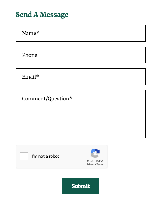
Research shows that having your fields stacked vertically (instead of lined up horizontally) helps increase conversion rates. The psychology behind this is that it’s easier to fill out for the end users which ends up getting more users to actually complete the form. If you can make the form easy for them to comprehend and fill out, the more likely they will actually do it. Win, win.
- One Question Per Row
This is another psychological trick to make users think the form is easy. By limiting the form to one field in each row, the form will look simple and therefore you’ll see more users filling it out and completing the form. Trying to have multiple fields in a single row is going to start making the form look more complicated so users will just simply not fill it out. Asking them to try and comprehend multiple rows and columns of fields and to respond accordingly is a losing battle. It’s best to just make it easy for them.
- Limit The Number of Questions
Only list fields on the form that are “essential” (too soon?). Just because you don’t mark them all as mandatory doesn’t make the form visually smaller on the page. The more fields that are listed on the form, the less likely a user is going to spend the time to actually fill out the form. If a user sees a lot of fields, they won’t even bother filling it out. Therefore only put a field on your form that is actually necessary. The rest of the information you want can be gathered later once you’ve built a relationship with your lead. Yes, that means more work on your end later, but it’s better to have the lead than to not have the lead.
- Higher on the page
|
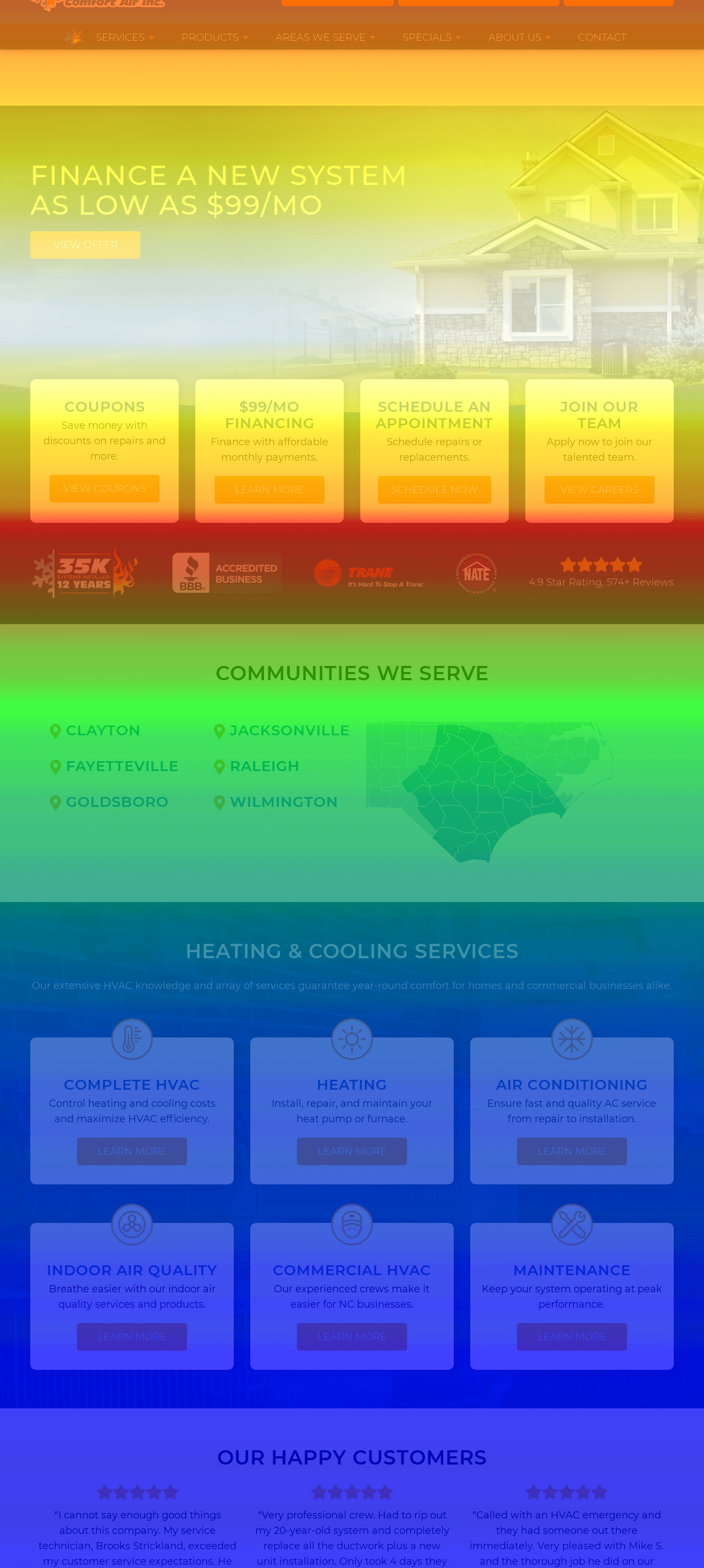
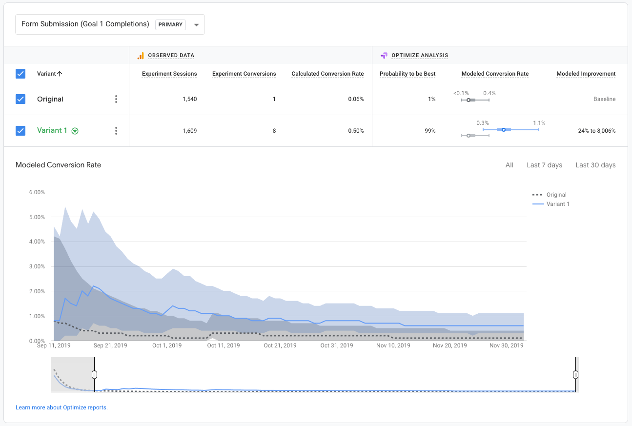
When you look at the heatmap of nearly any web page, you’ll notice that the content at the middle and bottom of the page does not get seen by most of your visitors. Majority of the time, a user will hit a page, maybe scroll down a little bit before they leave the page. Users do not look far for the information they want. So if you want a user to see your form (or even fill it out), you need it high on the page. That way they can actually see the form before they decide to leave the page. Give yourself a fighting chance. Best practices say to put your call-to-action in the very first section of the page (called “above the fold”) so a user doesn’t even need to scroll to see it. We recently did a test on this one ourselves. We took an old page that had a form at the bottom and tested it against the same page with the form moved to be near the top of the page – no other changes. The original page only had 1 form conversion while the revised version had 8. The conversion rate increase was phenomenal, so we pushed the revised version to be the final layout of the page. |
 |
- High Contrast Submit Button
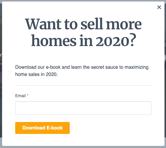
By making your submit button stand out, you’re making it extremely clear to the user what they are supposed to click on. You want that submit button to have high contrast to the surrounding color of the page so that you make it stick out. If your button is blending in, it will not be as obvious to the user what they are supposed to do. This is just another psychology trick and pulls their attention to the action you want them to take.
In addition, try to utilize a call to action other than “Submit”. That generic phrase is not enticing enough. Instead, try to incorporate verbiage that confirms the action you want them to take. For example, if the form is inviting the user to get a quote for a service, why not have the button say “Get a Quote”. Or if they are filling out a form to download the gated document, how about labeling the button with “Download PDF”. These action phrases will help push users to actually take the action.
- Add ReCaptcha
ReCaptcha is the verification step at the end of forms that verify you’re a human and not a bot. You’ve likely seen these before and not realize it. Sometimes you have to select all the pictures with a bicycle in it or something random. Newer ones are done automatically in the background without you even knowing.
The main value for you is that you receive a lot fewer spam submissions on your form. That means less time filtering through submissions and a backed-up inbox from notifications. The secondary value is with building the user’s confidence that they are submitting a form to a person and not to a bot. Even though it’s designed to protect you, it can subconsciously create a trust factor for the website visitor. If they trust you, they’ll be more likely to complete your form.
- Multi-Step Forms
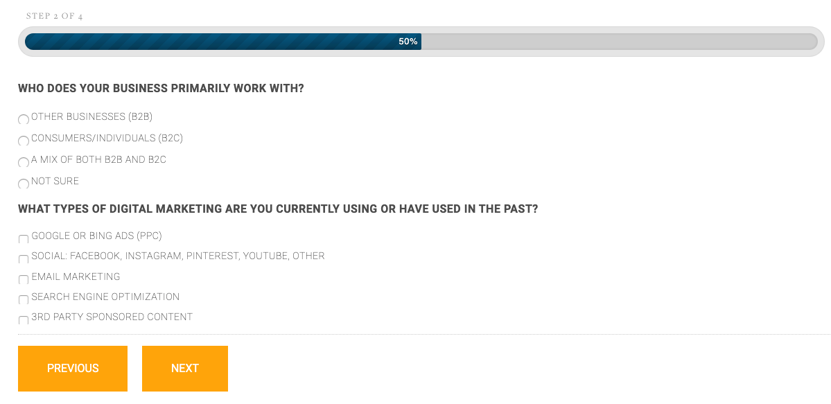
Multi-step forms are exactly what they sound like – a lengthy form broken down into several steps. For site visitors, these forms are less overwhelming and feel more approachable. The progress bar acts as physiological encouragement for users to complete the form too. Depending on your lead gen strategy, you may ask for their contact information upfront or save those more sensitive questions toward the end of the form when users have a bit more skin in the game. If you can’t avoid a short form and have to ask a lot of questions, this is a great way to do it. Multi-step forms are great for account creation, questionnaires, demo requests, or any longer form.
Do Your Own Form Testing
Of course, with all of these best practices, you don’t just have to take our word for it. You can test it. Using a simple optimization tool like Google Optimize, you can test each of these scenarios and see what helps increase your website’s conversion rates. See what happens when you have vertical forms instead of horizontal or placing it higher on the page instead of the bottom. Run A/B tests to see how the changes affect your conversion rates and let your own data lead you in the right direction.
If you’re not sure how to run the test or want some help optimizing your site for conversions, we’d be happy to help.


